This page contains a tutorial for the SAAN page. Guests can access a demo by clicking here.
The Login Screen
The user is greeted with a login screen. To login to the SAAN demo page use the username “gt_saan_demo” and password “gt_saan_demo” and press the login button. For convenience this is pre typed into the inputs.
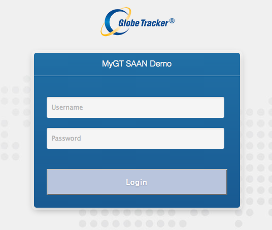
Picture 1: The login screen
After a successful login the user gains access to the SAAN user interface. In the upper right corner you can choose whether to display Map (default) or Satellite images. Choosing Map also gives you the option of displaying the terrain.
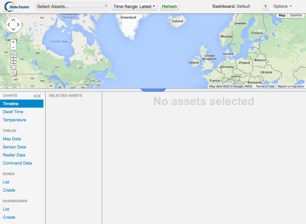
Picture 2: The default SAAN display
Asset Selector
The user can fetch information on assets via the Asset Selector. After pressing the “Select Assets …” button a dropdown tab appears with a list of assets accessible to the user. All or individual assets can be selected/deselected. It’s possible to search for assets in the list by typing in the filter input. When an asset is selected it’s information is added to the user interface, and when deselected its information is removed from the user interface.
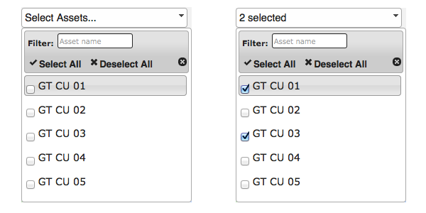
Picture 3: Selecting assets via the Asset Selector
Time Range Selector
Choosing the time range on the data to fetch on selected assets is done via the Time Range Selector. Press the “Time Range” button to get a dropdown with available date options. By default only the latest data point is selected but you can easily choose to fetch data a day/week/month back in time. You can also choose a custom time range by pressing “Custom Range”, two calendars appear in the right part of the dropdown where you select the time range (start and end date) and then press “Search”.
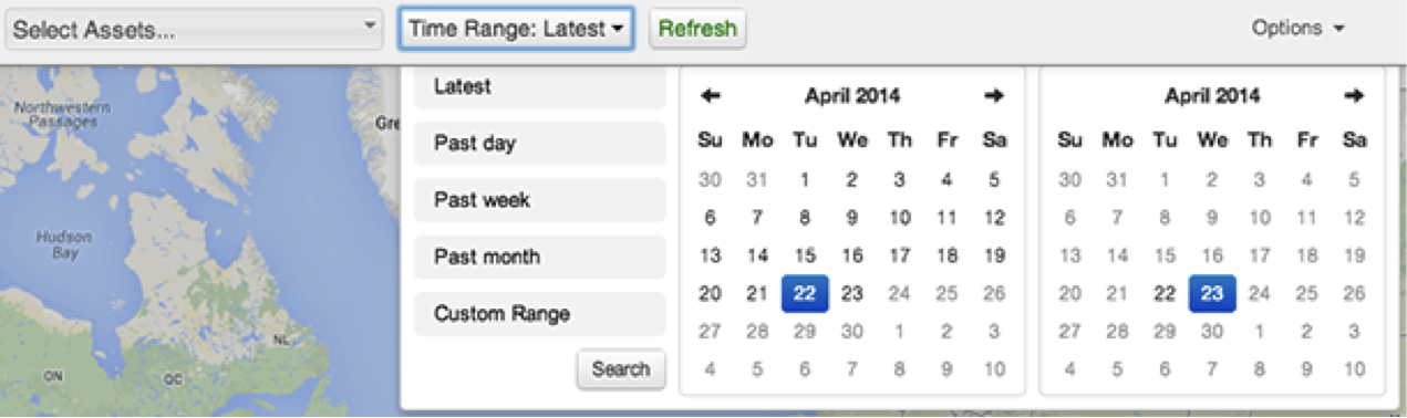
Picture 4: The Time Range Selector
Refresh Button
The refresh button right to the Time Range Selector initiates a re-fetch of information on selected assets. It turns red when 15 minutes have passed since data was fetched, to inform the user that new data points might be available.
The Map Controls
In the upper left corner of the map we have the default map controls:
- Used to navigate left/right/up/down through the map, you can also simply left click and move the mouse around while keeping the left mouse button pressed down.
- These control the zoom level. Click + to zoom in and — to zoom out. This can also be done via the mouse wheel: scroll down to zoom in and scroll up to zoom out.
- This is a best fit button of the map. The map is panned/zoomed to the best possible view for the data being displayed.
- Pressing this button puts the map in a default pan and zoom position.
- Click this button and use the mouse to click and drag over an area of interest. The map is panned/zoomed to that area of the map. Can also be activated by holding down the Shift key.
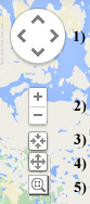
Picture 5: Map controls
Data point locations of selected assets over selected timerange are drawn on the map as grey circular markers. Individual marker can be clicked to view more information on the data point in a pop-up block which can be removed by pressing the ‘x’ in in its upper right corner.
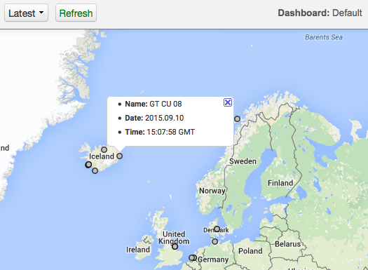
Picture 6: Viewing more information on a data point
Assets View
The Asset View beneath the map enables you to view detailed information on selected assets data. In its second column we have a list of the selected assets. You can hide an asset by unchecking the checkbox in front of it, or remove it by clicking the ‘x’ button behind it (this does the same as unchecking the asset in the Asset Selector). In the first column we have the following options for viewing assets data: Charts, Tables, Dashboards and Zones. You can hide or show the asset list column by clicking on the toggle button between “CHARTS” and “SELECTED ASSETS”.
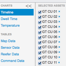
Picture 7: The toggle button to show or hide the Selected Assets list
You can choose the ratio between the Map window and the Asset view window. You do this by pressing and holding your mouse at the split line between the windows and pull the line up or down as you wish. When you have made your choice, you can switch between your view and the original one by pressing the blue toggle button at the center.
Picture 8: The split line to set your Map window versus Assets view window ratio and toggle button to switch views
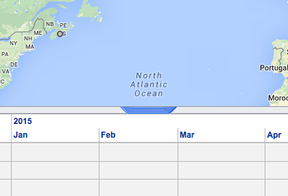
CHARTS
Timeline
Each selected asset is displayed in a timeline table in the third column where data points are displayed based on time. Data points close to each other, cluster together. When zooming in on the timeline table the data point clusters break apart until only single data points remain. The timeline table has the following controls: + — ◄ ►.
The plus sign zooms in, the minus sign zooms out, and the arrow signs move left and right. You can also move the mouse over the timeline table and scroll down to zoom in, scroll up to zoom out, and left click hold and drag to move left or right.
The red line in the timeline table indicates current time, underneath it is a blue draggable line. When the blue line is dragged to place left of the red line the time value of that place is affixed to the left end of the timeline table when using the plus and minus signs to zoom in and out. To disable this functionality place the blue line on the right side of the red line.
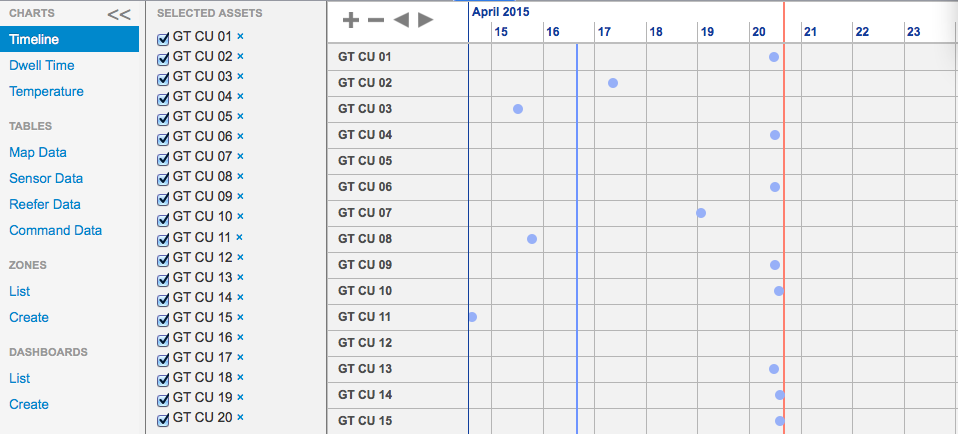
Picture 9: The timeline table
Dwell Time
This feature displays the zone distribution of the data in a pie-chart and a table to it’s right. Percentages for the biggest pie slices are shown. Move the mouse over the smaller slices to view their percentages. Click on a row in the table and the corresponding data point pops up on the map and the clicked row gets highlighted. Click the row again to close the pop-up.
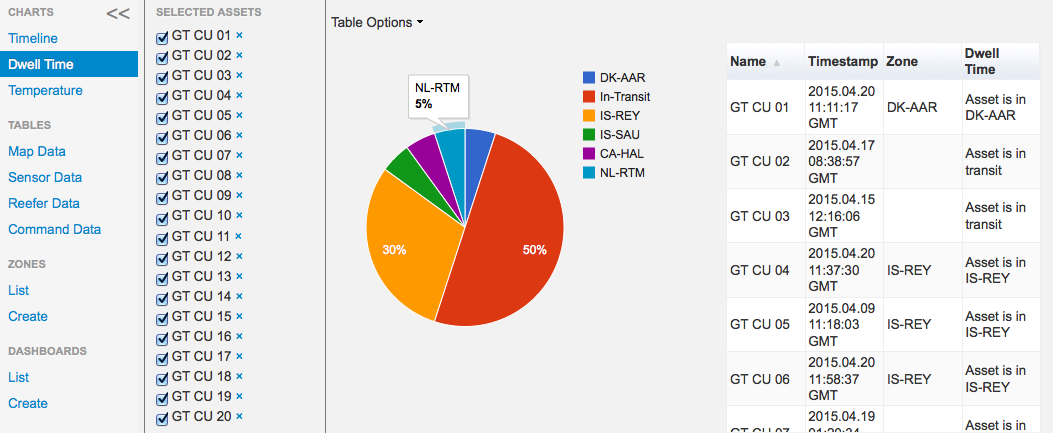
Picture 10: Zone distribution chart
Clicking “Table options” above the pie chart gives you further options for the table. You can choose how many data points are displayed on each page: 10 per page, 50 per page or a single page view where all data points are displayed on a single page. Data columns can be added or removed. Remove column by pressing the ‘x’ on the column name bubble, add one by pressing the ’+’ icon and choose a name from the drop-down menu.
Temperature
Displays temperature data in a chart if available for the selected assets. For those viewing the SAAN Demo page not all of the units hold temperature data. When you slide the mouse over a data point, you can see which temperature this asset is set to, and which temperature it is returning. You can also export the chart to .csv file as a table, or a .png as a chart image, under Chart Options. Finally, to view the labels for all the assets holding temperature data, you can click the up and down arrows under the label list to the right.
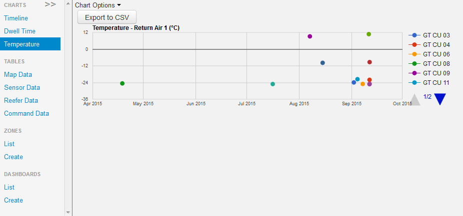
Picture 11: Temperature data chart
TABLES
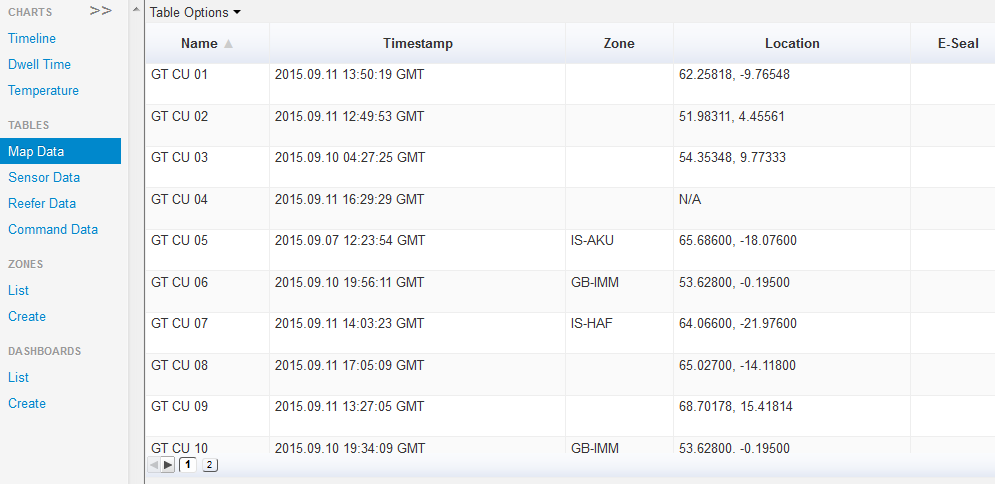
Map Data
Displays data points in a table format. Click on a row and the corresponding data point pops up on the map and the clicked row gets highlighted. Click the row again to close the pop-up. For those viewing the SAAN demo page, not all of the units show map data.
Picture 12: Map Data in table format
Press the “Table Options” above the map data table to view the table options.

Picture 13: Table Options
The number of data points displayed on each page can be changed between 10 per page, 50 per page and single page view where all data points are displayed on a single page. The data can be downloaded as a CSV file by pressing the “Export to CSV” button. Data columns can be added or removed. Remove column by pressing the ‘x’ on the column name bubble, add one by pressing the ’+’ icon and choose a name from the drop-down menu.
Sensor Data
Displays tables for Sensor Data. Use the drop-down to choose between viewing a table for E-Seal Events, Peripherals, Temperature or Tire Pressure. For those viewing the SAAN demo page, limited Sensor Data is displayed there.
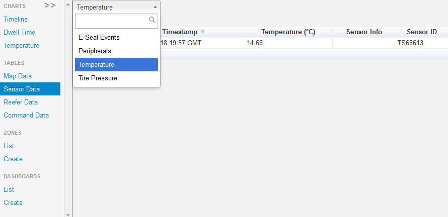
Picture 14: Sensor data table (limited Sensor data is displayed in the SAAN demo page)
Reefer Data
Displays a table populated with reefer data for assets setup with reefer control. Use the drop-down to choose whether to view a table for Cargo Temperature, Battery Voltage, Ambient Air Temperature, Fuel Level, Hour Meter or Alarms. For those viewing the SAAN demo page not all of the assets have reefer data.
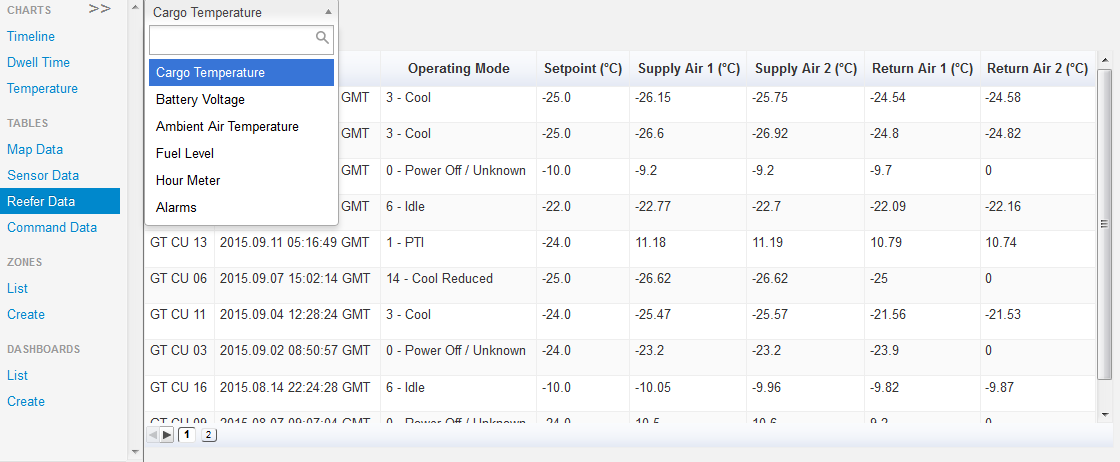
Picture 15: Reefer data table
As previously noted, by clicking “Table Options” you can choose how to display your tables. You can choose between 10 data points per page, 50 per page and single page view where all data points are displayed on a single page. The data can be downloaded as a CSV file by pressing the “Export to CSV” button. Data columns can be added or removed. Remove column by pressing the ‘x’ on the column name bubble, add one by pressing the ’+’ icon and choose a name from the drop-down menu.
Command Data
Displays a table populated with commands sent to the reefers. You can choose between displaying the following: Pending Commands, Executed Commands, Command Replies and Cancelled Commands. These commands are set using the Remote Administration (see under Options below). The table shows you the date of command creation, command type and command status (pending, executed or cancelled). While viewing the table for pending commands, you can click “cancel” in the rightmost column to cancel the command before it is executed.
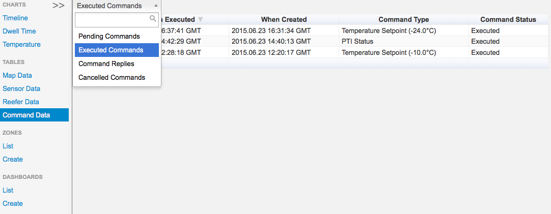
Picture 16: Command data table (limited Command data is displayed in the SAAN demo page)
ZONES
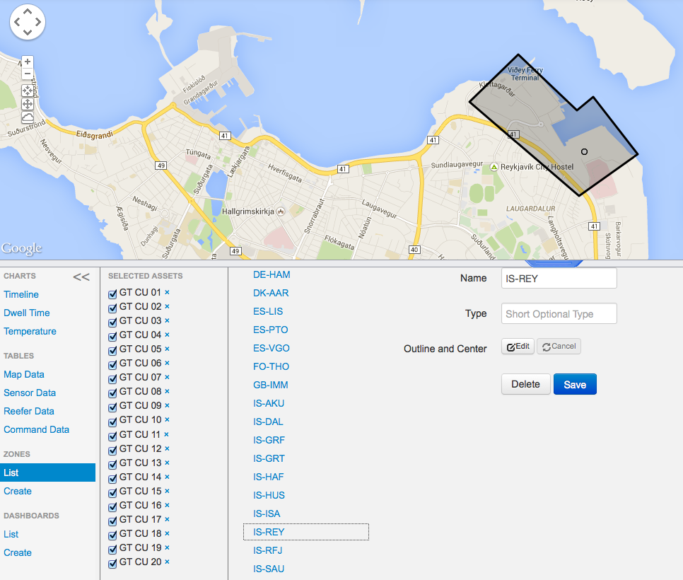
Zones – List
Shows a list of all created zones. Selecting a zone from the second column displays and zooms into the zone on the map. In the column to the right you are able to edit the name and outlines of the selected zone.
Picture 17: List of Zones
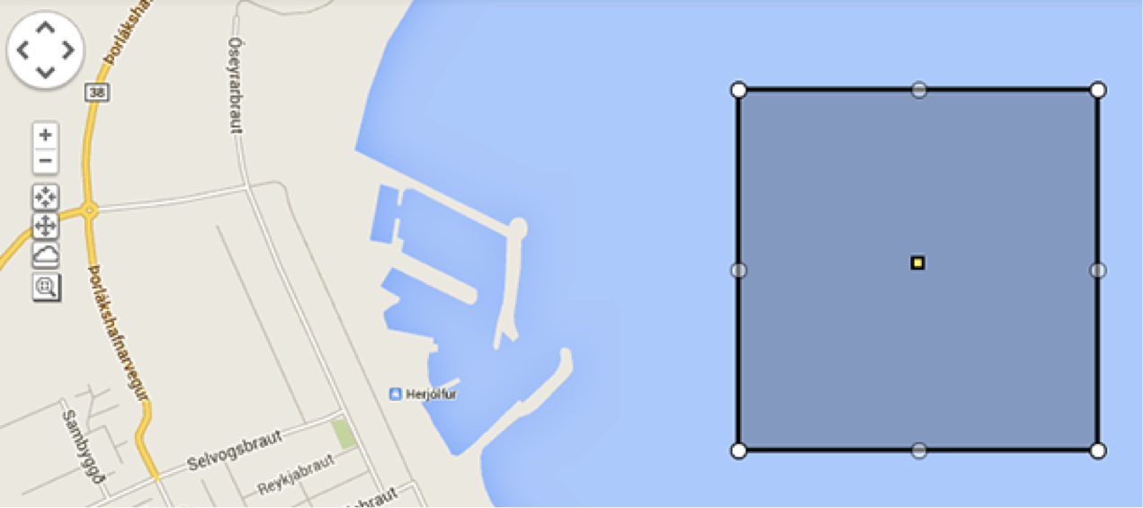
Zones – Create
Creates a new zone. Zoom into the place where you wish to add a zone and press ‘Create’. A grey polygon with a yellow square will appear on the map, the yellow square represents the ‘center point’ of the zone. Additional corners can be added to the polygon by dragging a grey point to place. Fill in the name, drag the polygon outlines to place, place the yellow square at a suitable ‘center point’ and press save. Note that zones can’t be created, edited or deleted in the SAAN demo page.
Picture 18.1: After pressing ‘Create’ a polygon appears on the map.
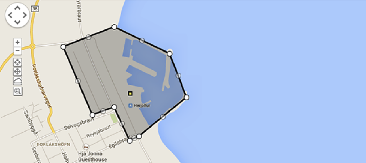
Picture 18.2: Polygon covers the zone and has a neatly placed center point.
DASHBOARDS
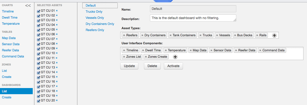
Dashboards – List
Shows a list of your dashboards. In the upper left corner you can immediately choose a dashboard that displays all assets, or Trucks only, Vessels only, Dry containers only or Reefers only. You can then add to the list by using the plus under “Asset types” or you can remove assets by clicking on each type. Under “User Interface Components” you can add and remove components in the same way, by clicking each component to remove it, and by clicking the plus sign to add a component. When you are done with your adding and removing, you click “update” below and “activate”. In the SAAN demo page you only get “Default” dashboard and you cannot update it. In the full version you can add and delete your dashboards and update them. When you click “Activate” a Pop-up window pops up and asks you to confirm the activation, and to notify you that all assets will be deselected.
Picture 19: List of dashboards
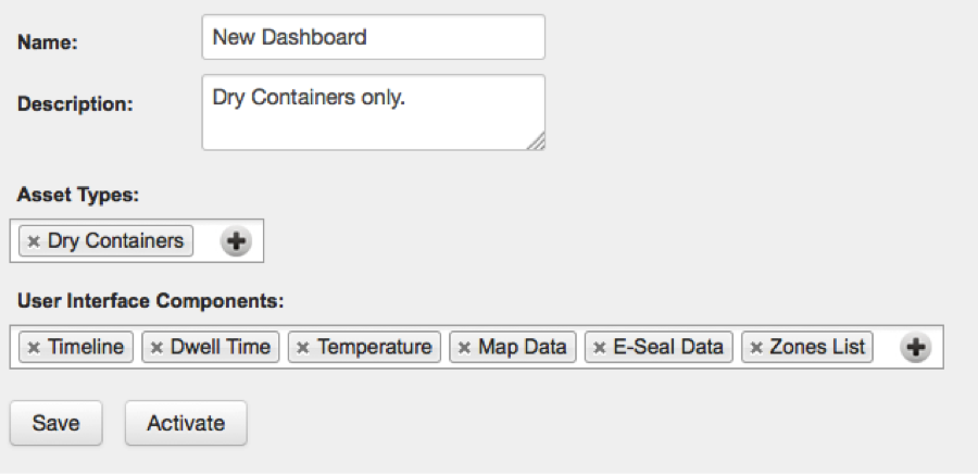
Dashboards – Create
Creates new dashboards. You can edit your dashboards under the previous Dashboards List. In the “Name” section you choose a title for your dashboard. In “Description” you can write a short description of it. In “Asset Types” you choose which types your dashboard applies to and in “User Interface Components” you select which components you would like to appear on the dashboard, such as timeline, map data and so on. When you have made your selections click “Save” and then “Activate” to activate your new dashboard right away.
Picture 20: Creating a dashboard
Options
The Options menu can be accessed in the top right corner, it contains the following: About, Remote Administration, Sensor Management, Map Overlay, Language, Timezone and Logout.
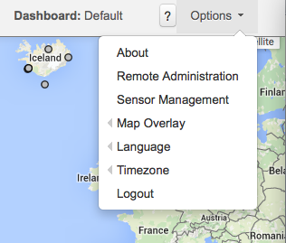
Picture 21: Options in the top right corner
About
This displays a panel with the version number of the user interface amongst other things.
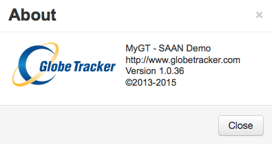
Picture 22: About panel
Remote Administration
This displays a panel in which commands can be sent to the reefer, given the user has the permissions to do so, username and password required. In the left column a list of currently selected assets is displayed, which corresponds with what you have selected in the Asset Selector. Communication Interval controls the rate of which data points are sent from the reefer, it accepts integers from 1 to 18. Press the ‘Advanced’ button to see the Temperature Setpoint and PTI inputs. To send a Temperature Setpoint or PTI command the user has to type in a valid username and password. The Temperature Setpoint takes a number with one decimal place in the range between -30.0 and 30.0 °C. The PTI (stands for Pre-Trip Inspection) is a testing process on the reefer where its controls and sensors are tested, this process takes up to 4 hours to complete. Note that temperature controls are tested in the PTI proccess and as a result temperature is changed between fixed points. The following PTI commands are available: Full PTI, Short PTI, Terminate PTI, and PTI Status. Full PTI initiates a full PTI process, Short PTI initiates a partial PTI process which takes less time to finish than a Full PTI, Terminate PTI ceases a running PTI process, and PTI Status tells the reefer to send back it’s current PTI status. Note that it’s only possible to either submit a Temperature Setpoint or a PTI command, this is quite rational as normally we don’t want to send both of these commands to the reefer at the same time.
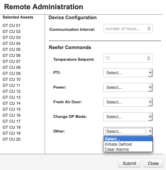
Picture 23: Remote Administration panel
Sensor Management
Displays a panel asking you to choose which of your selected assets you would like to assign Sensors to and which ones to ignore. In the SAAN demo page you cannot assign Sensors.
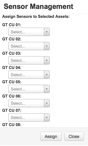
Picture 24: Sensor Management panel (in the SAAN demo page you cannot assign Sensors)
Map Overlay
The user can choose between the following data point views: Center Point and Yard Data. When the Center Point radio button is selected all data point located inside a zone are displayed on a predefined zone center point. When the Yard data radio button is selected the actual location of the data point is shown inside a zone. You can also choose to display zone locations.
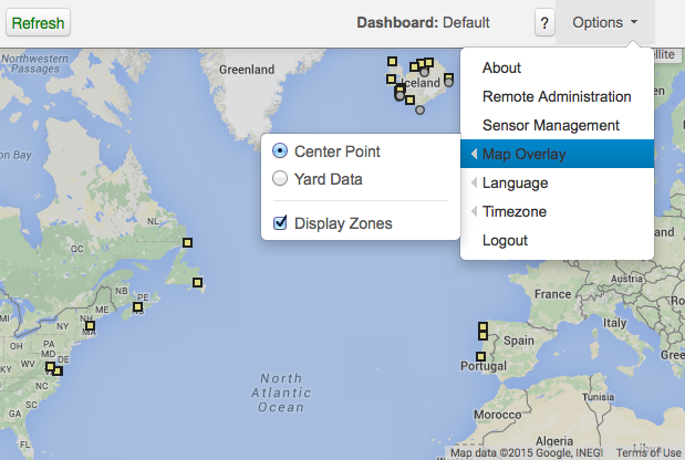
Picture 25: Example of the Map overlay displaying Zones
Language
Choose whether to view the page in English or Chinese.
Timezone
Here you can choose between GMT and System timezone.
Logout
This logs the user out of the SAAN user interface. Accessing it again requires login.